用Sass搞定Flat风格的图标长投影

让我们来学习Hugo Giraudel老师的这篇文章
亲爱的童鞋们如果过去两年没有长眠不醒的话一定知道这个长长的投影的故事(2015应该是Material Design的时代了,长江后浪推前浪啊消费者是残酷的掩面嘤嘤嘤...)
咳咳咳...总之,用长投影给文字引来全场目光还是相当靠谱的。
用图片或者SVG实现都OK,但是绝对没有用CSS指挥浏览器感觉有成就感啊。
不过手写这个的话真的是要你命,浪费时间,现在捡起Sass,用15行代码打造智能投影新时代..新时代..时代..代..
先确定API
.foo {
    box-shadow: long-shadow($args...);
}

.bar {
    text-shadow: long-shadow($args...);
}box-shadow跟text-shadow区别在于前者有一个跟模糊有关的参数(不过这里也没用到...), 说到文字阴影, IE 10+支持它的模糊哦酷不酷炫!我真的不是在骗你哟!
我们这个函数需要几个参数:
- 投影方向
- 投影长度
- 投影颜色
- 投影是否需要渐隐效果(默认是false)
- 需要计算的投影层数
/// 纯扁平已经out啦,长长的影子是我滴爱
/// 支持 `box-shadow` 和 `text-shadow`.
/// `cos` 和 `sin` 函数可以用Compass或者其他库支持(SassyMath之类,要不然看下面链接也行)
///
/// @author Hugo Giraudel
///
/// @link https://unindented.org/articles/trigonometry-in-sass/ 用Sass实现三角函数 `cos` 和 `sin`
///
/// @param {Direction} $direction
///     投影方向,可以是角度也可以是方向的关键字
/// @param {Length} $length
///     投影长度
/// @param {Color} $color
///     投影颜色
/// @param {Bool | Color} $fade [false]
///     投影是否需要变化:
///     - `false` means no fading, shadow is `$color`
///     - `true`  means fading from `$color` to transparent
///     - a color means fading from `$color` to `$fade`
/// @param {Number} $shadow-count [100]
///     需要计算的投影层数
///
/// @return {List} - List of shadows
///
/// @require {function} Compass/helpers/math/cos
///     http://compass-style.org/reference/compass/helpers/math/#cos
/// @require {function} Compass/helpers/math/sin
///     http://compass-style.org/reference/compass/helpers/math/#sin
///
/// @example scss - 用法
/// .foo {
///   text-shadow: long-shadow(42deg, 1em, #16a085);
/// }
/// .bar {
///   box-shadow: long-shadow(to top left, 150px, hotpink, tomato);
/// }
@function long-shadow($direction, $length, $color, $fade: false, $shadow-count: 100) {}
开始code
转换一下$direction这个参数, 定义一个map让我们可以用关键字映射角度。
$conversion-map: (
  to top: 180deg,
  to top right: 135deg,
  to right top: 135deg,
  to right: 90deg,
  to bottom right: 45deg,
  to right bottom: 45deg,
  to bottom: 0deg,
  to bottom left: 315deg,
  to left bottom: 315deg,
  to left: 270deg,
  to left top: 225deg,
  to top left: 225deg
);

@if map-has-key($conversion-map, $direction) {
  $direction: map-get($conversion-map, $direction);
}然后我们就只剩下一件事要做了(节奏有点快啊(。◕ˇ∀ˇ◕))):从1循环到$shadow-count这么多次, 每次做出一层阴影。
// ...

$shadows: ();

@for $i from 1 through $shadow-count {
  // ...

  $shadow: ...;
  $shadows: append($shadows, $shadow, 'comma');
}

@return $shadows;
来来来看下$shadow怎么算。非常非常简单哟就两个三角函数哟。用角度的正弦值算出X轴位移,用余弦值算出Y轴位移。
$x: sin(0deg + $direction) * ($i * $length / $shadow-count);
$y: cos(0deg + $direction) * ($i * $length / $shadow-count);这里用0deg和$direction相加的用意在于使得结果自动转化为前者的单位表示, 就是说$direction是渐变或者弧度也没关系,会自动转换成角度(deg)。
颜色的话事就比较多了,根据$fade的不同有三种情况, 如果$fade是:
false, 那么输出就是$colortrue, 那么输出是从$color到透明的一个中间值- 一个颜色, 那么输出就是
$color到$fade的一个中间值
除了第一种情况,我们在每次循环中都要重新计算颜色.
// If `$fade` is `false`
$current-color: $color;

// If `$fade` is a color
@if type-of($fade) == 'color' {
  $current-color: mix($fade, $color, ($i / $shadow-count * 100);
// If `$fade` is `true`
)} @else if $fade {
  $current-color: rgba($color, 1 - $i / $shadow-count);
}这样一层的$shadow就算出来了。
$shadow: $x $y 0 $current-color;完成版函数
@function long-shadow($direction, $length, $color, $fade: false, $shadow-count: 100) {
  $shadows: ();
  $conversion-map: (
    to top: 180deg,
    to top right: 135deg,
    to right top: 135deg,
    to right: 90deg,
    to bottom right: 45deg,
    to right bottom: 45deg,
    to bottom: 0deg,
    to bottom left: 315deg,
    to left bottom: 315deg,
    to left: 270deg,
    to left top: 225deg,
    to top left: 225deg
  );

  @if map-has-key($conversion-map, $direction) {
    $direction: map-get($conversion-map, $direction);
  }

  @for $i from 1 through $shadow-count {
    $current-step: ($i * $length / $shadow-count);
    $current-color: if(not $fade, $color, if(type-of($fade) == 'color',  mix($fade, $color, ($i / $shadow-count * 100)), rgba($color, 1 - $i / $shadow-count)));

    $shadows: append($shadows, (sin(0deg + $direction) * $current-step) (cos(0deg + $direction) * $current-step) 0 $current-color, 'comma');
  }

  @return $shadows;
}
举几个栗子
.foo {
  text-shadow: long-shadow(
    // Shadow should have an angle of 42 degrees
    $direction: 42deg,
    // Shadow should be contain within a 100x100 box
    $length: 100px,
    // Shadow should start this color
    $color: #16a085,
    // To finish this color
    $fade: #1abc9c
  );
}
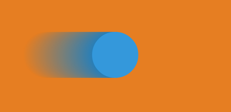
.bar {
  box-shadow: long-shadow(
    // Shadow should go to bottom right (45deg)
    $direction: to left,
    // With a length of 15em
    $length: 15em,
    // From this color
    $color: #2980b9,
    // To this color
    $fade: #e67e22
  );
}
.baz {
  box-shadow: long-shadow(
    // Shadow should have an angle of 25deg
    $direction: -125deg,
    // Spread on 120px
    $length: 120px,
    // From this color
    $color: #8e44ad,
    // To transparent
    $fade: true,
    // With only 10 shadows
    $shadow-count: 10
  )
}
最后可以去看看这个pen。
参考文章
![img_ex_3]: (http://dab1nmslvvntp.cloudfront.net/wp-content/uploads/2015/01/1421924369ECeMqZF.png)